As the USA is the biggest economy in the world; the US yield curve is an important indicator of economic conditions that needs to be monitored carefully. The US yield curve shows us how relaxed monetary policy currently is. We can infer from this the likely path of asset markets.
Examining the US yield curve at the moment reveals that policy continues to remain HIGHLY ACCOMODATIVE. The carry trade remains on. But the danger of a rate rise in the future, whilst not imminent, is ever present. The next downturn could be huge in magnitude and financially destructive for many.
Yield Curve Timing
The shape of the yield curve is an indicator of the looseness of monetary policy. A steep curve results from central bank attempts to force the short-term rate of interest down relative to the long-term rate, set by markets. This gives market participants an incentive to borrow cash and invest in assets; effectively a carry trade.
A flat or inverted yield curve comes about when the central bank raises the short-term rate in-line with or above the long-term rate. The central bank response is usually brought about as a response to an increase in the CPI. A flat or inverted yield curve has been a good predictor of collapses in asset markets in: 1974, 1980, 2000 and 2008 to name a few.
Incentives at Work
The central bank would like to keep policy loose and the yield curve steep, but in practice they need to respond to political pressures that impinge on decision making. During times of a low or falling CPI, the political pressure errs towards the side of policy loosening.
During times of rising prices, the public can become volatile as we have seen in the Middle East. People perceive that inflation is eroding their standard of living and demand action to curb inflation. Central banks respond by raising rates and hence tightening policy.
In order to use the US yield curve for investment timing, it is important to consider both the current shape of the curve AND its likely direction of travel. The direction of travel is most easily discerned through examination of the CPI. If CPI is high then policy is likely to be tightened and vice versa.
US Yield Curve Graphs

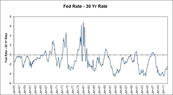
US Yield Curve (1955-2012)
The broadest representation of the US yield curve is provided by using the Fed rate as the short-term rate and the 30 year T-bond rate as the long-term rate. Using this measure, you’ll notice that from 1950, swings in yield curve differential were increasing in volatility, up to the end of the 1970’s. The curve had more stability in the 1980’s, but a worrying pattern of ultra-loose monetary policy developed from the early 1990’s and became established in the 2000’s.
In response to the tech stock bust in 2000, short-term rates were lowered aggressively in order to limit the damage. Whilst this stabilised the market and eventually led to increases in nominal asset prices, it simply led to an even bigger collapse further down the road when short-term rates were inevitably raised and the curve normalised. After 2008, policy has been loosened aggressively again, repeating the cycle.

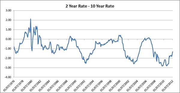
US Yield Curve (1976-2012)
A more narrow but popular representation is provided by the 2 year – 10 year yield curve. Rather ominously, you’ll notice that the current spell of easing has been the most aggressive. Most of the tightening in the last year or two has come from falls in the long-term rate, rather than rises in the short-term rate.
The disturbing trend of recent times has been just how relaxed central bank policy is. Each attempt in the post-2000 world to normalise the shape of the curve (2000, 2007) has led to major collapses in assets markets, followed by further attempts by central banks to aggressively loosen policy.
Investment Implications
The short-term rate has once again been taken down to extreme levels, resulting in a very steep US yield curve. The carry trade is well & truly on: borrow cash short-term and put it anywhere, is the name of the game courtesy of the Fed.
We have seen throughout history that once short-term rates are raised and the US yield curve flattened, a crash is not very far away. But before then it looks as though we will have another year or two of carry-trade bubble, as the Fed continue to provide cheap and easy money.